Why Japan Pink Jerseys Became a Trend in Football and Streetwear

Japan pink jerseys took off because pink already carries deep “Japan” meaning—then streetwear made it wearable beyond match day. Once sakura palettes, bold graphics, and collector-style concepts hit the same silhouette as a football shirt, it stopped being a novelty and started being a look.
Introduction
A Japan pink jersey exists because pink is already a “native” Japanese color story—especially through sakura season—and designers love how it softens a football silhouette without making it feel delicate.
In practice, you’ll see two lanes. One is subtle: dusty blossom tones, pale gradients, minimal crests. The other is loud: dragons, Tokyo collage graphics, and big all-over prints that feel closer to a streetwear tee than a traditional away kit.
From the drops we’ve handled at NipponKits, pink works best when it’s doing something intentional: either referencing a real cultural palette (sakura, ukiyo-e-inspired shading) or leaning into modern Japan design (graphic density, clean negative space, smart badge placement). Random pink is forgettable. Designed pink sticks.
Key context
- Sakura palette: Pink tones inspired by cherry blossoms and the seasonal visuals around hanami (flower viewing).
- Concept kit: A Japan-inspired football jersey built around design storytelling, not an on-pitch release schedule.
- Streetwear fit: Wearing a football shirt like a graphic top—layered, oversized, styled with denim, cargos, or a clean jacket.
- All-over print: Full-shirt artwork (dragons, city scenes, landscapes) where the fabric is the canvas.
What does pink mean in Japanese culture?
In Japanese culture, pink is most commonly tied to sakura—seasonality, change, and that short-lived “right now” feeling that cherry blossoms bring every year. That’s why pink can feel both soft and powerful at the same time.
It also sits naturally inside Japanese design aesthetics: controlled color, careful emptiness, and contrast. A pale blossom pink against charcoal or deep indigo looks calm, but it still pops. And because sakura imagery shows up everywhere from stationery to street posters during spring, the color doesn’t read as “random.” It reads as “Japan.”
One more nuance people miss: pink in Japan isn’t only cute. Depending on shade, it can feel ceremonial (muted rose), modern (hot neon accents), or nostalgic (washed pastel). That range is exactly why designers keep returning to it for football shirts that want to live in the streets, not just on the pitch.
Why are some football jerseys pink?
Some football jerseys are pink because the color solves a design problem: it’s different enough to stand out, but flexible enough to style with everyday outfits. A pink Japan football jersey can feel like a statement without the “I’m in full kit” vibe.
For Japan-themed designs specifically, pink also gives creators a cultural shortcut that’s still respectful when done right. Sakura tones, blossom textures, and ink-wash gradients can reference Japanese seasonal visuals without needing heavy symbols everywhere.
- Contrast: Pink reads clean against black, navy, grey, and white—classic football base colors.
- Wearability: Pastel pink can function like a neutral in streetwear, similar to cream or light grey.
- Storytelling: A Japanese pink football shirt can signal spring, Tokyo neon, or traditional art palettes depending on the shade and graphics.
Not every pink shirt is trying to be “Japan-coded,” though. The ones that become trends usually have a clear visual anchor: blossoms, city scenes, a motif like a dragon, or a specific design era that feels collectible.
Different styles of Japan pink jerseys: what are the main design inspirations?
Different styles of Japan pink jerseys usually fall into five inspiration buckets: mythic motifs, Tokyo street visuals, clean fan-style minimalism, deeper plum palettes, and creator-led concept storytelling. Each one wears differently, even if the base color looks similar in photos.
Here’s the easiest way to think about it: if the shirt is doing a lot visually, you style it like a graphic tee. If it’s subtle, you style it like a clean football top.
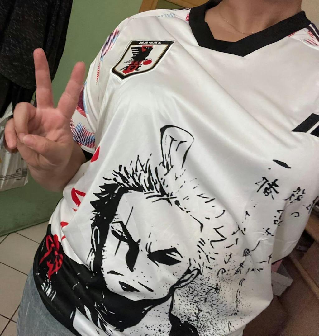
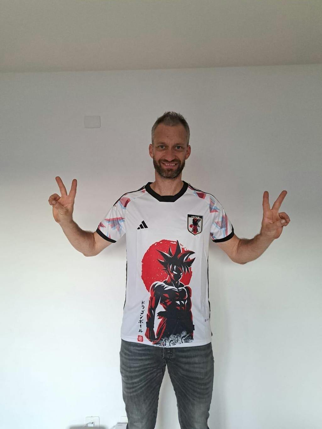
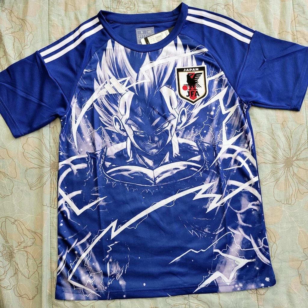
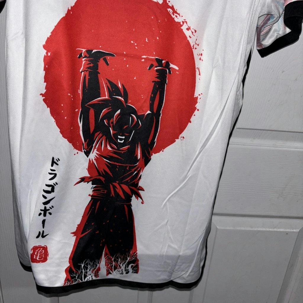
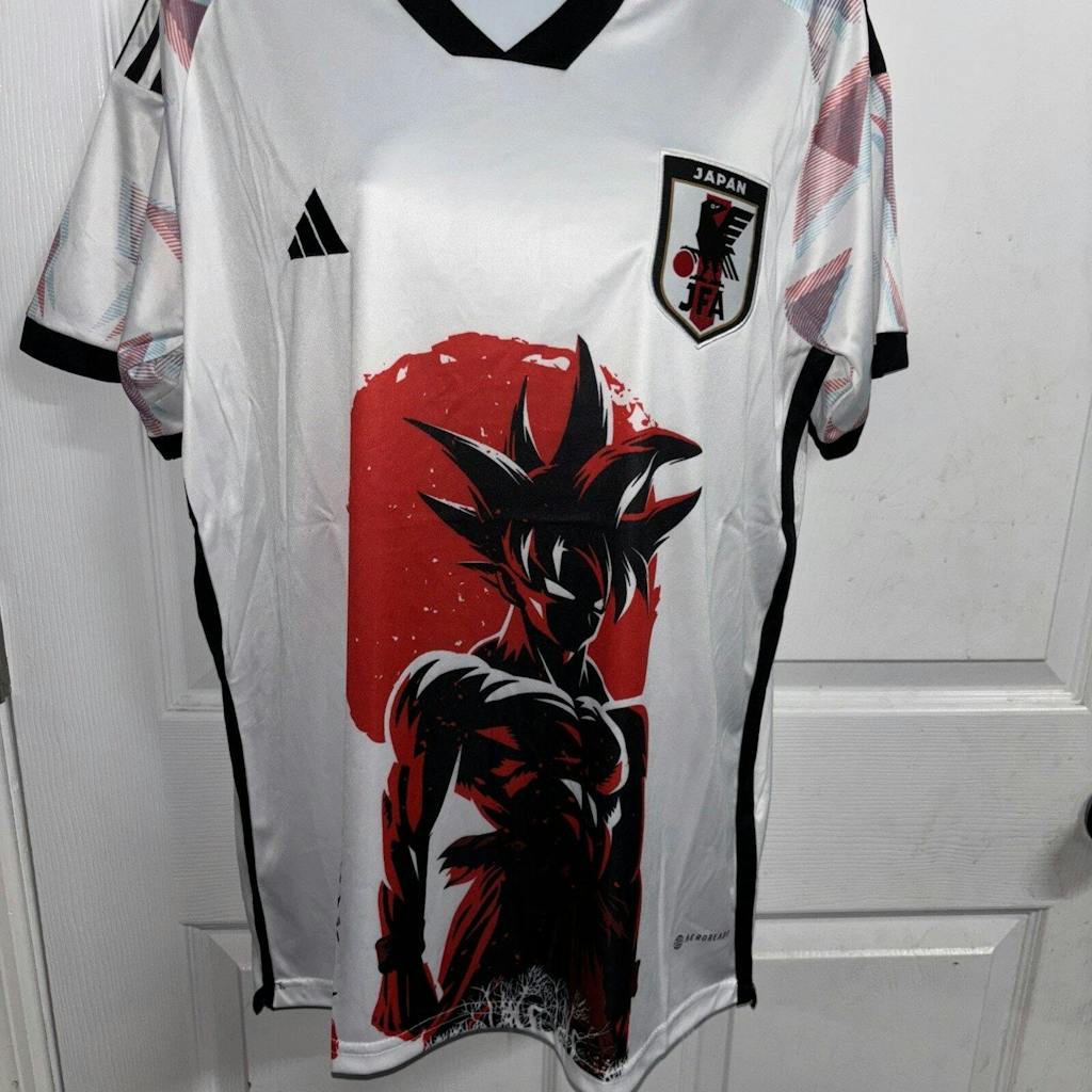
Dragon inspired jersey design
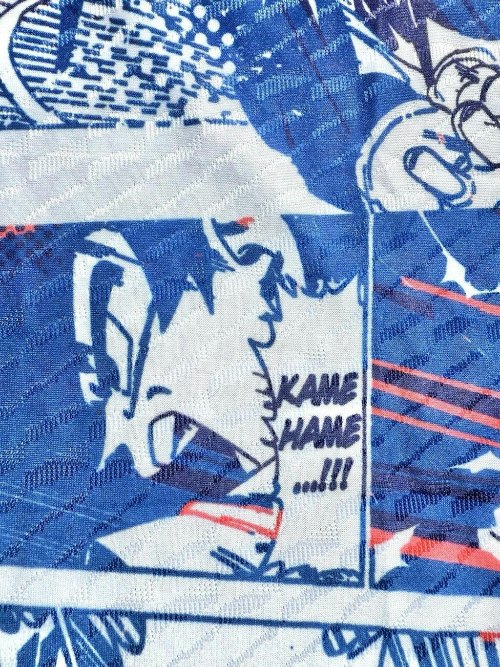
A dragon-inspired pink Japan football jersey is built for impact. Dragons in Japanese visual culture often represent strength and movement, so the artwork tends to be sweeping, dynamic, and high-contrast.

When it’s done well, the dragon isn’t just “a cool graphic.” It creates direction across the shirt—your eye moves from shoulder to crest to hem, the same way a good tattoo composition works. That’s why this style is popular with collectors.
If you want a concrete example of the dragon lane, the Japan Pink Dragon Jersey shows how pink accents can frame a heavy graphic without turning the whole shirt into bubblegum.
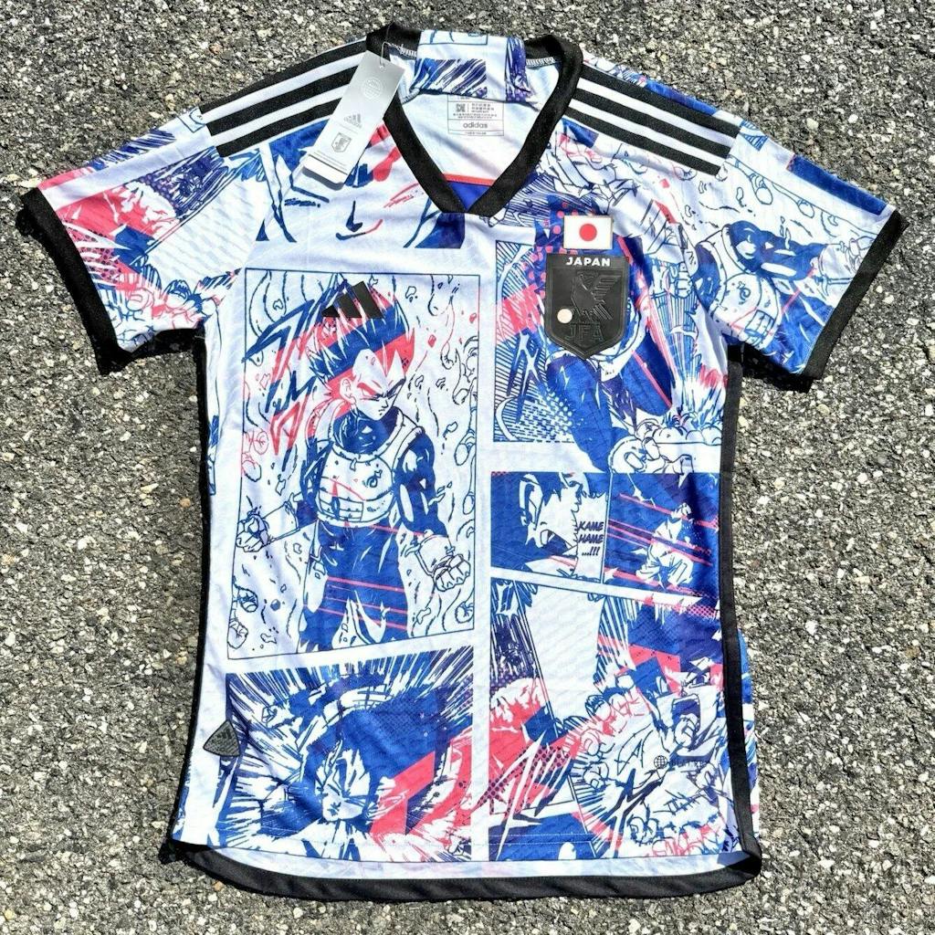
Tokyo street aesthetic jersey
The Tokyo street aesthetic style is basically “city collage” done on a football silhouette. Think signage, map-like lines, skyline cues, transit references, and that layered poster-wall feel you get walking through dense neighborhoods.

This is where the Japan pink kit starts acting like streetwear. The graphic density makes it feel closer to a printed tee, but the collar and panel lines keep it in football territory. It’s a sweet spot if you want the cultural energy without going mythic.
A good reference for that look is the Japan Tokyo Pink Jersey, which leans into city visuals instead of blossoms-only symbolism.
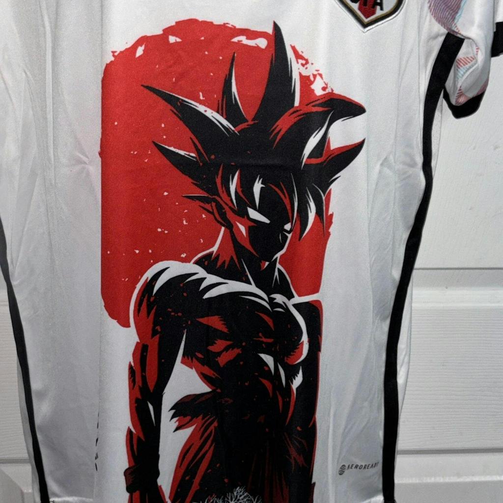
Japan World cup Fan edition pink jersey
Fan-edition pink designs are the quiet lane: fewer graphics, more negative space, and a cleaner “match shirt” feel. This is the version that people who normally only wear navy or white can actually pull off.

A Japan pink soccer jersey in this style usually works best with one standout detail: a soft gradient, a crisp crest area, or subtle shoulder striping. It’s also the easiest to layer under a jacket because nothing fights the outfit.
If you want that understated look, the Japan Pink Jersey Fan Version is the kind of piece you can wear like a neutral top.
Imperial plum inspired jersey
Imperial plum sits closer to purple than candy pink, and that shift matters. A Japanese pink football shirt in plum tones reads richer and more “night” than “spring,” which is why it pairs so well with black denim, charcoal cargos, and darker sneakers.

This lane often borrows the calm side of Japanese color aesthetics: deeper shades, restrained accents, and a single scenic element (like a landscape silhouette) instead of a full collage.
A clear example is the Japan Imperial Plum Jersey, which shows how pink-adjacent palettes can feel more mature without losing the Japan vibe.
Nigo inspired concept jersey
Nigo-inspired concept styles lean into the “design world” side of Japan street culture: simple shapes, confident color blocking, and a drop-like collector energy. The point isn’t to mimic a specific historical kit; it’s to make a shirt that looks like it belongs in a capsule wardrobe.

This is usually the cleanest bridge between football culture and streetwear culture—because it doesn’t rely on a huge illustration to explain itself. It’s about silhouette, color, and branding restraint.
If you’re exploring that lane, the JFA Japan x Nigo Special Edition Jersey is a solid reference point for how “concept drop” design can still feel like a Japan football shirt.
What is the difference between an official Japan national team jersey and a Japan pink kit?
An official Japan national team jersey is designed for match identity and federation alignment, while a Japan pink kit is typically a concept-driven design built around culture, color, and collectability. In other words: one is about representing the team on the pitch, the other is about representing Japan aesthetics through football design.
If you’re wondering “are pink Japan jerseys official or concept designs?” the honest answer is that most pink-forward pieces you see online are concept drops rather than the core national-team color story. That’s not a downgrade. It’s just a different purpose.
Common misconceptions & clarifications
- Misconception: “Pink automatically means away kit.” Clarification: Pink is often used for design storytelling and streetwear wearability, not only as a strict away color.
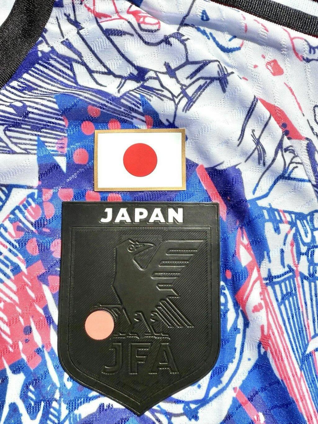
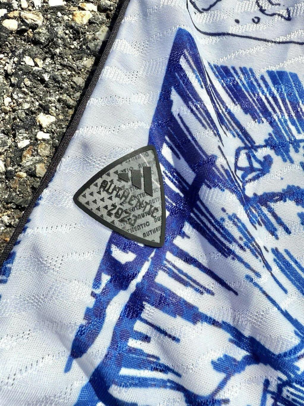
- Misconception: “If it says JFA, it must be an official on-pitch release.” Clarification: Badge styling can appear on Japan-inspired concepts; don’t assume match issuance from visuals alone.
- Misconception: “More graphics means lower quality.” Clarification: All-over print is just a different design approach; what matters is execution, clarity, and how it wears.
- Misconception: “Pink is too loud for football culture.” Clarification: Football fashion has always had bold kits; pink just happens to translate especially well to modern streetwear.
My take: if your goal is match-day identity, you’ll usually want the more traditional palette. If your goal is outfits, a Japan soccer jersey pink colorway is often easier to build around because it sits closer to streetwear color logic.
If you want to see the Japan-first range in one place (not just one color), the Japan jerseys hub is the cleanest starting point because it’s organized by style, not by hype.
Why Japan pink jerseys became popular in football culture
Japan pink jerseys became popular in football culture because they solve a real problem: a lot of people love football shirts but don’t want to look like they’re wearing a full uniform outside the stadium. Pink softens the signal while keeping the shape.
They also fit the collector mindset. Football culture has always had “special” shirts—third kits, anniversary looks, rare colorways. Pink concepts slide into that same space: a limited-feeling piece you wear because it’s different, not because it’s required.
And then there’s the Japan factor. Japan design is famously good at taking something functional and making it feel considered. When a pink Japan football jersey pulls from sakura palettes or city visuals, it feels like a design decision, not a gimmick.
One thing we’ve noticed at NipponKits: the best-performing pink styles aren’t trying to be everything at once. They pick a lane—Tokyo collage, dragon art, minimal gradient—and then commit. That commitment is why they show up in football fits on social media and still look intentional.
How to choose a Japan pink jersey
To choose a Japan pink jersey, start with how you’ll actually wear it: streetwear layering, casual daily rotation, or collector display. The “right” pink Japan football jersey is the one that matches your wardrobe color base and your tolerance for graphics.
Use this quick checklist before you pick a style. It’s the same filter we use when we’re deciding whether a new Japan pink kit will get worn or just admired on a hanger.
Quick checklist: picking your ideal Japan pink jersey
- Choose your lane: minimal (fan edition) vs maximal (dragon/Tokyo collage).
- Match your closet: pastel pink pairs easiest with light denim and neutrals; plum pairs best with dark fits.
- Pick your “hero detail”: crest area, gradient, hem artwork, or full print—one should lead the design.
- Plan the fit: oversized reads more streetwear; cleaner fit reads more “football shirt.”
If you’re leaning toward collector-style graphics and special colorways, our limited edition Japan jerseys section is usually where the boldest pink concepts live.
Japan football shirt sizing: how does it fit compared to EU, UK, and US?
If you’re buying a Japan pink soccer jersey for streetwear, sizing is half the style. A clean fitted look and an oversized layered look can be the same shirt—just different sizing choices.
Japan football jerseys run one full size smaller than standard EU, UK, and US sizing. A Japan S maps to EU/UK/US M — not XS. Size up one as your default starting point, then adjust based on whether you want a clean fitted look or a relaxed streetwear fit.
| Japan size (JP) | UK / EU size | US size | Chest (cm) |
|---|---|---|---|
| S | M | M | 88–92 |
| M | L | L | 92–96 |
| L | XL | XL | 96–100 |
| XL | XXL | XXL | 100–104 |
Not sure about your measurements? Use the jersey size calculator before ordering.
Bottom line
- A Japan pink jersey works because pink already has Japan cultural meaning through sakura and seasonal design cues.
- Most pink-forward Japan designs you see online are concept-led drops, built for style and collectability rather than match schedules.
- Minimal fan-style pinks wear like neutrals; dragon and Tokyo collage designs wear like graphic streetwear tops.
- Plum tones feel more mature and “night,” while pastel pinks feel spring-forward and easy to layer.
- Fit matters: size up one from typical EU/UK/US as a starting point, then decide between clean or oversized.
FAQ
Do Japan pink jerseys only work in spring?
No—spring is just the easiest cultural connection because of sakura. Pastel pink looks clean in summer with light denim or shorts, while plum and deeper pinks work well in colder months with black layers. If you treat the shirt like a color accent (not the whole outfit), it stays wearable year-round.
How do I style a Japan soccer jersey pink colorway without it looking like a costume?
Keep everything else simple. Pair a busier Japan pink kit with black jeans or neutral cargos, then choose shoes that don’t compete. If the shirt is minimal, you can add one extra piece—like a grey hoodie under it or a clean overshirt on top. The goal is one statement, not five.
What’s the difference between a gradient pink shirt and an all-over print?
A gradient design is mostly about color transition and negative space—cleaner, calmer, easier to layer. An all-over print is artwork first, shirt second: dragons, Tokyo collage scenes, or landscapes that fill the fabric. If you want “streetwear graphic tee energy,” go all-over. If you want “everyday rotation,” go gradient.
How should I wash a Japanese pink football shirt to keep it looking sharp?
Turn it inside out, wash cold, and skip harsh heat. That combination helps preserve both color and print clarity over time. If the shirt has heavy graphics, air drying is the safest move because high heat can dull the finish faster. Simple habit, big payoff.